Personal Brand Kit
This personal branding project gave me the opportunity to create a cohesive design suite that reflects both my creativity and professionalism. I developed a full brand kit using Adobe tools, incorporating consistent colors, fonts, and personal touches like a meaningful bird motif and custom patterns. Each element, from the resume to the website header, was thoughtfully designed to showcase my identity and style, while still being polished and versatile.
This project helped me refine my design process and gave me tools I will confidently use in my professional future.
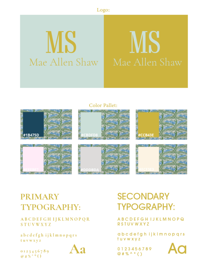
The creative choices I made—like using bright, fresh colors and a clean, subtle pattern—set the tone for the entire project and established the visual identity of my brand from the start. These design elements weren’t just used in my brand kit, but carried throughout all of my personal branding to ensure consistency and cohesion. Additionally, the bird motif holds personal significance, as my family has always referred to me as “Birdie.” This small yet meaningful detail helped inject a bit of my personality into the design and made the brand feel genuine and memorable. My logo is intentionally simple and clean, reflecting the approachable and polished feel I want my brand to convey. I wanted anyone who interacts with my materials to get an immediate sense of who I am—creative, thoughtful, and detail-oriented.
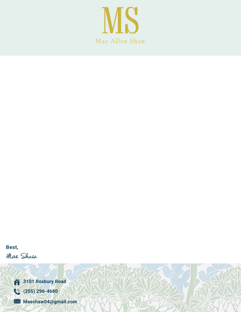
When designing my cover letter template, my goal was to create a piece that felt both polished and personal while staying true to my overall brand identity. I incorporated the same consistent color palette, typography, and subtle pattern used throughout the rest of my branding to maintain visual cohesion. The layout is clean and professional, allowing the content to stand out while still reflecting my creative style. To make it feel uniquely mine, I included a personal signature at the end, tying in a warm, human element that aligns with my brand’s tone. Every detail was chosen to give future employers a clear sense of who I am—professional, intentional, and creatively driven.
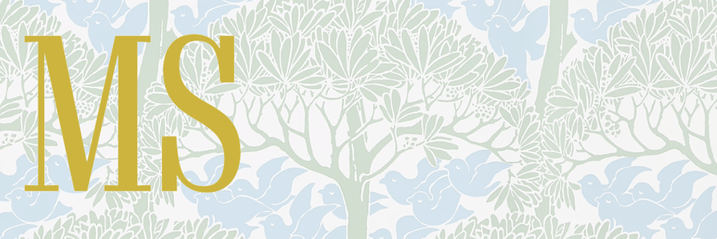
For my website header, I incorporated my brand’s soft color palette and custom pattern to create a cohesive, inviting look. I intentionally designed a simple, clean logo to keep it easy to read and recognizable. This header reflects my overall branding and is also featured on my personal website.
The front of my business card reflects the creative and playful side of my personal brand. I used bright, fresh colors and intentional design elements to represent my personality while keeping the layout visually engaging and unique to me.
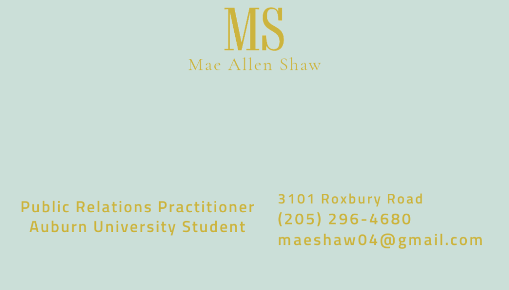
The back of the card takes a cleaner, more informative approach. I maintained consistency in my color palette and typography, ensuring it aligns with the rest of my branding while clearly displaying my contact information in a professional format.
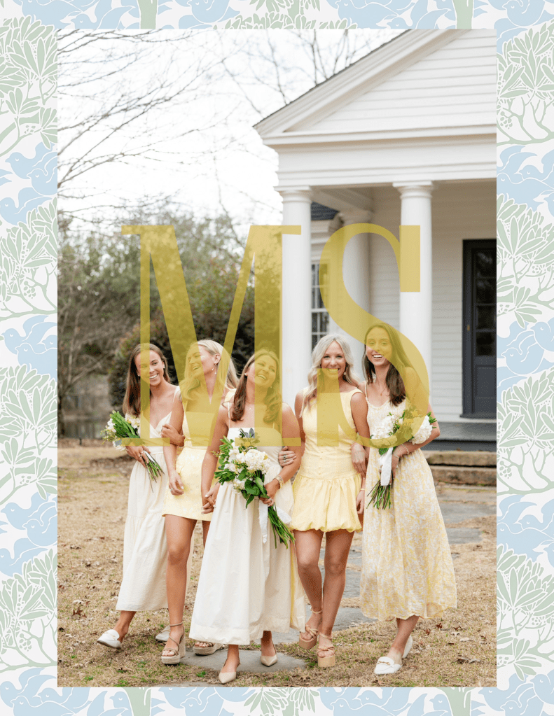
My watermark is a simple version of my logo, incorporated through Adobe Lightroom to protect and personalize my work. I layered it over a background featuring my custom pattern, tying it into the rest of my branding and reinforcing visual consistency. Using a watermark is important not only for ownership and protection, but also for subtly reinforcing brand identity across all creative content.
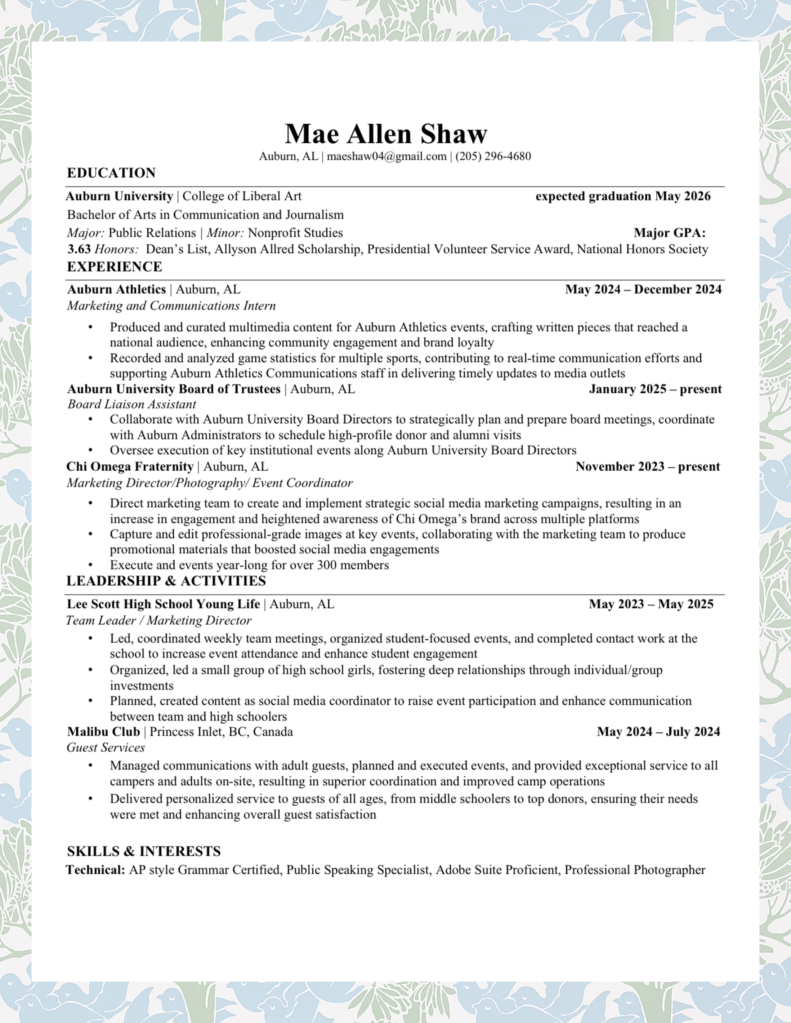
For this project, I kept my resume professionally written and optimized for AI scanners, ensuring clarity and functionality. To align with my overall brand, I incorporated my background pattern, adding a personal touch while maintaining a polished and clean layout. This approach allowed me to present my experience professionally while still reflecting my unique style.
